13 of the Best Squeeze Page Examples on the Internet
This post is for Internet Marketers (and bloggers) who cannot figure it out (yet) how to build high-converting squeeze pages that turn as many visitors into subscribers and they want to see real-life examples of the best squeeze pages. If you like list building on steroids then this article is for you because…
We’re going to take a look at 13 of the most highest-converting squeeze page examples – analyze what makes them powerful – so you have a “what works” model in front of you, ‘copy-cat’ ready!
Before we dive in, let’s answer some of the most common questions…
What does squeeze page really mean?
If you’ve been online for at least a month, you’ve heard about terms such as…
- Lead capture page (or lead capture magnet)
- Teaser page
- Name squeeze page
These terms are referring to a web site (or blog) page that has a very specific objective:
*** “Capturing” visitor’s name & email address. Sometimes even their phone, snail, or zip code.
So you want to build a squeeze page to attract leads (potential customers) you can start building relationship with and SHARE more about you, your specialty (skills or knowledge) and what you have to offer (or recommend) – a product, a service or maybe a training program.
This is an ethical and honest method; we’re not talking about spam practices nor taking hostages!
Why should someone give you their email address?
Do you remember: when was the last time you subscribed to a list or newsletter?
Why did you do it? More than probably, it was because it got your attention and offered something of true interest to you: a mouth watering sample, a desirable freebie item or maybe a how-to info-packed report that you found good enough that you had to enter your email and snatch it up.
Definition of a high-converting squeeze page
What makes some landing pages convert as high as 65% while the most struggle for 5%?
There are 3 key ingredients I want you to consider
#1 – Overall Offer (HEADLINE) – the simple, the better (it should be reader benefit-oriented)
“On the average, five times as many people read the headline as read the body copy. When you have written your headline, you have spent eighty cents out of your dollar.”- David Ogilvy
#2 – Email opt-in field – the higher positioned within the page, the better
#3 – Design – the simpler, the better (it helps load your page fast)
If you want to uplift your conversions, you should also uplift your email form and its call-2-action. Give visitors the option to scroll their mouse to find your form, and you lose most of them. Make it quick to subscribe to your list and you’ll add more leads than before, guaranteed.
What does “high-converting” mean?
Don’t make the assumption that a newsletter is a squeeze page. You have to put that offer into a dedicated page on your site or blog. Show no other distractions!
MindValley Labs split testing fanatics have proven… “Tests have shown that landing pages with too many navigational links consistently under-perform”
I spent 3 and half hours researching facts and statistics on the topic and I still couldn’t find any reliable I could share. My opinion is that newsletters convert on average anywhere between 1% and 10% while top squeeze pages can get 25% and even 65% conversions.
What counts the most is the quality of the traffic (visitor) reaching your landing page combined with the speed of your page, the overall offer (headline) and the position of your email form.
Before you create your first landing page, you should always perform in depth RESEARCH: understand what is being offered on the market and what is really demanded. Then ask yourself these 3 cardinal questions:
1. What is my target audience (client) having problems/challenges with?
2. Are there any products (free and paid) on the market solving that problem/challenge yet?
3. How to make my headline reader-oriented while sounding hype-free (credible)?
“Advertising people who ignore research are as dangerous as generals who ignore decodes of enemy signals.” – David Ogilvy
A winning headline fills the gap between your target audience #1 need and your offer (solution)
13 Squeeze Page Examples
and what makes them powerful
#1. Stupid Simple Squeeze Page
MothleyFool.com

What makes this powerful?
This is the most effective, simplest “design”, no distractions, just “enter your email” landing page I’ve ever seen. If you do a split (or multivariate) test with all the other 12 examples you’ll read next, you might be amazed to see this one WINNIG in 9 out of 10 cases!
#2. Header Squeeze Page
Dan Lew
What makes this powerful?
There’s a tight debate on industry-related blogs and forums: “Should you have a header or no header on a landing page?” and the answer is: NEVER!, if you have an amateurish-looking graphic, or one which doesn’t emphasize your offer in 3 seconds or less.
Take a look at this winning header instead: it embeds the headline (promise), eCover and brand. YES!
#3. Video Squeeze Page
Eben Pagan
What makes this powerful?
It’s the headline promise: intriguing and reader-oriented. No doubt.
It has been said this was (one of the) most often “copy-cat” landing pages for many years, when it had no graphics and no video. Eben has now modernized it and I assume these elements gave a quick boost in conversion. The original page had high subscription rates already!
#4. Audio Squeeze page
Armand Morin
What makes this powerful?
Instant audio grabber is the key here. I’d prefer a video on that landing page though, as they’re offering a video presentation on their software. This is more like a disguised “pre-sale” landing page. It works if you do a product launch or want to share a demo of your program.
#5. Graphic Squeeze Page
Peter Garety
What makes this powerful?
I forgot to count the numbers of how many times I’ve stumbled upon bloggers with mailing list offers (the numbers of bloggers not having a list at all is even higher!) but no graphic representation.
Don’t they have $20 for a pro-looking eCover? This has been tested and proven to double and even triple email subscriptions!
#6. Random Draw Squeeze Page
John Chow
What makes this powerful?
If you had the chance to sit down and talk with a blogger making $40k a month, and having real proof, would you download his free ebook showing you his “secrets”? For most aspiring bloggers, this claim would sound BALLONEY. But let’s not forget who’s behind this – John Chow – and how long it took him to reach this exposure, popularity and income. No pain, no gain!
Plus, I like his promise: “Just for signing up, you will be entered to win an Apple iPad!“
Think how you could implement this in your landing page strategy. Act as a product launcher!
#7. Try-It-Free Squeeze Page
CampaignMonitor.com
What makes this powerful?
You cannot neglect their niche-oriented product: email marketing software for designers and their clients. If more people would be client-focalized and not “all things to all people”, businesses would convert more visitors into loyal customers, guaranteed.
You will find these kinds of pages in the software/web hosting related industry where try before you buy is the standard, yet not all comply.
#8. Blog Integrated Squeeze Page
FreelanceFolder.com
What makes this powerful?
The mailing list offer is presented in the blog’s sidebar and they’ve also built a dedicated squeeze page for it. I like the “REASON WHY” title (headline) – it attracts struggling freelancers who cannot sleep at night thinking…
Why Some Freelancers Thrive while They’re Barely Surviving…
#9. Discount Squeeze Page
Dave Navarro
What makes this powerful?
In my opinion, this is the most profitable list one can setup because it mostly attracts buyers with card on hands. You won’t join such a list unless you’re interested in the niche products, and looking to save some money down the road, right?
If you advertise this page only to paid customers or private clients, you’d expect to receive super-high conversions, potentially 80% or more. Just test it and see how it goes!
#10. Newsletter Squeeze Page
CopyBlogger.com
What makes this powerful?
A free newsletter for smart Internet Marketers, coming from Brian Clark and CopyBlogger team? Who wouldn’t join that? Plus, the headline says…
“You don’t have to be a genius to master Internet Marketing”. Great USP! Also, notice the 20-part ecourse integrated into the subscription offer, smart!
#11. Sales Letter Squeeze Page
Yaro Starak
What makes this powerful?
It’s not the video, although it increases conversions, but what makes this page powerful is its unique sales letter style. It packs more elements than a simple squeeze: credibility-building testimonials and social proof graphics.
Although this might not get 60% conversion (let’s ask Yaro and find out!), I presume the quality of people joining in is top-notch because it takes a few scrolls to reach the sign-up form.
#12. eCourse Squeeze Page
Ramit Sethi
What makes this powerful?
The 7-day quickstart email course offer: straight to the point; 3 bullet points. Unique strategy.
#13. eBook Offer Squeeze Page
Daniel Scocco
What makes this powerful?
The eBook offer in itself. Daniel claims the content to be unique, in other words, he writes from personal experience, so it must be good as you’re learning from someone who runs pro blogs such as DailyWritingTips.com, DailyBits.com and TechCult.com
What You Should Do Next:
You want to split test your squeeze pages and see what squeeze page example or method works for your particular niche or industry. You don’t have to make all your pages stupid simple oriented unless you want to, nor add heavy design and slow your page loading time.
Testing will make the difference. You don’t have to upload video just because it’s the rage; maybe your visitors are not YouTube fanatics.
Now, what landing page idea do you like the most? Why? Let’s continue the conversation.
Send all your comments, questions and suggestions below…
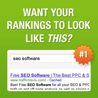
P.S. A top quality squeeze page is KEY, but without traffic it is just a page. Here’s how to attract 100+ leads a day to your page.


Thank you for the squeeze page break down.
You give a good point of view that I think other people can learn from.
Keep up the good work my friend.
Reply
codrutturcanu Reply:
March 12th, 2011 at 01:18
hey Ryan, thank you for joining the party. Feel free to spread the word about the post, I'm glad you've found it useful.
Reply
Hi Codrut,
This post is a treat! I love seeing a summary of the best types of tactics. I use AWeber, so the Stupid Simple with a second field for name, is my favorite.
I haven’t used squeeze pages in a while, since I usually put the request on my blogs. However, when the time comes, I’ll try out several of these ideas to see which one comes out on top.
Cheers,
Mitch
Reply
codrutturcanu Reply:
March 13th, 2011 at 14:39
Mitchell, time is now. Why wait? You have to understand that if you want blog comments and re-tweets or jut page views, drive your bulk traffic to your home page or blog post. If you want leads, then a landing page/squeeze page is key, so drive your traffic there.
Regarding as the email VS name field, I've tested both options, and when you require visitors name (or whatever other field you input), you actually get 5% less subscribers because you give them another roadblock which they'd have to get over.
Reply
Mitchell Allen Reply:
July 8th, 2011 at 17:03
Hey there, Codrut,
You asked, why wait? I missed this, but the reason is – I’m just now finishing up a product for launch. I was hunting around for squeeze page inspiration and had totally forgotten I’d bookmarked your post back in March.
Also, thanks for the Name tip. I’m may convert fewer but, with Aweber customization, I’ll get higher open rates by using names.
Cheers,
Mitch
Reply
Hi Codrut,
Goodness, man. Now I see what you mean about pouring 3 hours of effort into every post you publish. Your content is solid.
John Chow incentivizes his list with an iPad and that's huge; definitely one of my favorite approaches. Yaro, well, that's the first time I've looked at that landing page and as Pat mentioned ealier: I'd like it more with the CTA above the fold. BUT, there's something about the overall layout, colors, and video that draw me in. Plus, you can't deny he has some heavy-hitters for testimonials
Thank you for this…
Jon
Reply
codrutturcanu Reply:
March 14th, 2011 at 10:07
Thank you for dropping by Jon. Keep spreading the love.
P.S. Would love to check out some of your squeeze pages!
Reply
Hey Codrut,
Great Round up of some awesome squeeze pages. I like the Yaro's and John's squeeze pages.
Another great example of awesome squeeze page is Cloudniche.com.
Anyways, Thanks for sharing this awesome list man.
~Dev
Reply
codrutturcanu Reply:
March 14th, 2011 at 13:56
hi Devesh, I'm glad you found the post helpful; keep sharing the love my man!
Reply
Hi Codrut,
Wow, what a post! You know, I had NO idea that squeeze pages have evolved so much today. Personally, what attracts me is the headline, the simpleness (is that a word?) of the page and what they have to offer. I recently started testing different squeeze pages myself and the 2 I have up are running almost neck and neck. One is performing a little better than the other but they are both doing really well. Yeah!
You sure put a lot of time and effort into this post and boy do I appreciate it! So glad you stopped by my blog so now I have another great one to visit and learn from. Can't wait to go through more of your posts.
Thanks again and I'll be back soon.
Adrienne
Reply
codrutturcanu Reply:
March 14th, 2011 at 20:58
Adrienne, thank you for dropping by and commenting. I guess "keep it simple" model is still available in nowadays Economy, even for landing pages Are you using Google's web optimizer to split test your landing pages too?
Reply
Very informative post Condrut. I have been building several new splash and capture pages lately, so this is timely for me. Thank you for going into such great detail on this topic.
My recent post Big MLM Tip of the Day- Overcoming Objections How much does it cost
Reply
codrutturcanu Reply:
March 20th, 2011 at 22:57
hi Bill. Thank you for your comment. Spread the love and let me know if you need any help with your MLM-related landing pages. You know that building them is easy, since there are software tools handling that part, the real issue/problem I see most people face is getting the right headline appeal for the proper audience and converting as many visitors into subscribers.
Text (headline and call to action) is more important than design and layout. Copywriting is key in all aspects of marketing.
Reply
I think a few of them, such as #13, have way too much information and text on the squeeze page. I prefer less text on the squeeze page and more video. I kill it with the 3 step squeeze page:
1. Watch video
2. Enter Email
3. Get Free Product
It works for me such as this example: http://SqueezePageExample.com
Get the contact info…provide more info later.
Kevin
BestSqueezePages.com
Reply
Thanks for the sharing the different squeeze pages and your personal review on them. There's so many with great benefits. Which of them would you suggest to use?
Reply
Great examples! I don't think anything was left out. I have a style that I'm probably "stuck on" but I'm going to start testing other ways. Thanks for all the incredible ideas
Reply
Have you taken a look ever at KillerVideoSqueezePages.com? Fantastic examples of flashy yet productive (high converting) squeeze pages. I wonder what your opinion of them would be.
Reply